
From Data to Decisions.
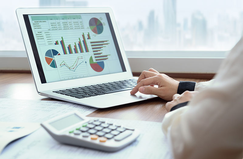
From the data captured from your utility bills and the chosen metrics, you are able to visualize information about your: Costs, Consumption, Greenhouse Gas Equivalents, Production and Facilities.
How many different departments and divisions of your organization would benefit from this information?
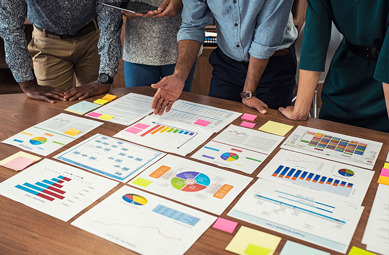
People in all functions of your organization can benefit. Operations, Sustainability, Accounting, Energy and Maintenance can all use the information and services to assist them. Giving them this resource, supports them in their roles and makes your jobs easier and more enjoyable. Because you all see the same accurate information, it helps the conversations in your work rooms and in your board room to be more productive. Those of different specialties can understand one another better and speak the same language.
Want to make it stand out?
You have access to any of 20 most common master reports. You select the facility, accounts and time period you want to see and the templates take it from there, pulling the data you need with just a few easy clicks.
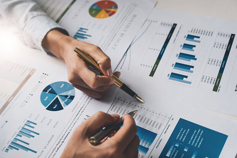
The software design experts can create custom visualization to help show off your data in a understandable, compelling way. Using Tableau®, our developer team members can create a picture from your numbers and create living reports and images for your review and presentation.


